Wedding Table Numbers and Menu Signs: A Complete Styling Guide
Let's be real: at your reception, half your guests will find their table by squinting across the room, locking eyes with the one sign that's tall enough to see, and walking toward it like a lighthouse. That sign is your wedding table number. It's doing more heavy lifting than almost anything else on the table, and most people don't think about it until three weeks out when the whole seating puzzle suddenly becomes very real.
So this is the guide I wish someone had handed me. We're going to cover wedding table numbers from every angle — numbers vs. names vs. a hybrid, how many you actually need, how big they have to be so people can read them from across a loud room, and all the ways to display them. Then we'll get into menu signs, because table numbers and menus almost always share a table, a font, and a moment of "wait, do we even need these?" By the end you'll have a shopping and printing checklist you can actually use.
One thing up front: if you're reading this and feeling behind, you're not behind. Table numbers and menu signs are some of the very last things you finalize, on purpose, because they depend on your guest count and seating chart being locked. Most couples don't touch this stuff until 4–6 weeks out. You're right on time.

What Wedding Table Numbers Actually Do (Beyond the Obvious)
On the surface, a table number tells a guest where to sit. Simple. But it's quietly tied to two other pieces of signage, and if you understand that connection early, the whole night runs smoother.
Here's the chain of events at a typical reception:
- A guest walks in and finds their name on the seating chart (or grabs their escort card). That tells them their table number.
- They scan the room for that number on a table number sign.
- They sit down, and a menu sign tells them what's coming.
That's three pieces of signage working as a relay. If your seating chart says "Table 7" but your table sign says "The Vineyard," you've broken the chain and created a knot of confused guests holding cards. So the very first decision isn't a design one — it's a labeling one. We'll get to that next.
If you want to see how all of these signs fit into the bigger picture of a wedding day, I walk through the full lineup in the complete wedding sign checklist — table numbers and menus are two stops on a much longer list, and it helps to see where they land.
Numbers vs. Names vs. Hybrid: Pick Your Labeling System First
Before you choose a font or a frame, decide what goes on the sign. There are three real options, and each one has trade-offs that matter more than they look.
Plain Numbers (1, 2, 3...)
The classic, and honestly the easiest on everyone. Numbers are short, instantly readable from a distance, and they map perfectly to your seating chart. If a guest is told "Table 12," they're looking for a "12," full stop. No translation needed.
Best for: most weddings, large guest counts (80+), anyone who wants zero confusion. If you're not sure, pick numbers. You will never regret picking numbers.
Table Names (The Vineyard, Paris, First Date...)
Names are charming and personal — places you've traveled, your favorite songs, wildflowers, wine regions, dogs you've owned. They make great conversation starters and they photograph beautifully.
The catch: names add a translation step. Your seating chart now has to clearly connect each guest to a named table, and guests have to remember "Lavender" instead of "5" while crossing a crowded room. With more than 10–12 tables, names get genuinely hard to scan. People will wander. Build in extra signage clarity if you go this route.
The Hybrid (Number + Name)
This is the sweet spot for a lot of couples, and the one I steer people toward most. The sign shows a big, bold number for wayfinding and a smaller name underneath for personality. "12 — The Lavender Field." Guests navigate by the number; they enjoy the name once they sit down.
Hybrid signs need a little more vertical space and a clear visual hierarchy (number large, name small), but they genuinely give you the best of both. If you're designing your own, an editable digital template makes this easy because you can resize and reposition the two lines of text yourself. You can browse the studio's wedding collection for hybrid-friendly layouts.

How Many Table Numbers Do You Actually Need?
More than you think, and the answer isn't just "one per table." Let's do the real math.
Start with your table count. A reasonable estimate: 8–10 guests per round table, or 6–10 per long banquet table. So a 100-guest wedding is usually 10–13 tables. But before you order exactly that many signs, account for these:
- The head table or sweetheart table. Sometimes it gets a number, sometimes a "Mr. & Mrs." sign instead. Decide now so you order the right count.
- Special tables. Gift table, cake table, guest book, escort card table, bar, dessert station — these often want their own little signs, even if they're not "numbered" tables.
- One or two spares. Things bend, spill, and go missing in transit. If you're printing, an extra sign costs almost nothing. If you're ordering printed-and-shipped, ask whether a spare is cheap to add.
- Final headcount fluctuation. RSVPs trickle in late. Order based on your venue's max table count, not your optimistic guest list, so a few extra "yes" replies don't leave you a table short.
A simple rule: final table count + 2–3 specialty signs + 1–2 spares. For most 80–120 guest weddings, that's somewhere around 14–18 signs total. Knowing this number early matters because it changes whether DIY printing or printed-and-shipped makes more sense (more on that at the end).
Sizing and Visibility: The Part People Get Wrong
This is where good intentions meet a loud, dim reception hall. A table number that looks perfect on your laptop can be invisible from fifteen feet away once there are centerpieces, glassware, and a roaming photographer between the guest and the sign.
Standing table numbers (the most common)
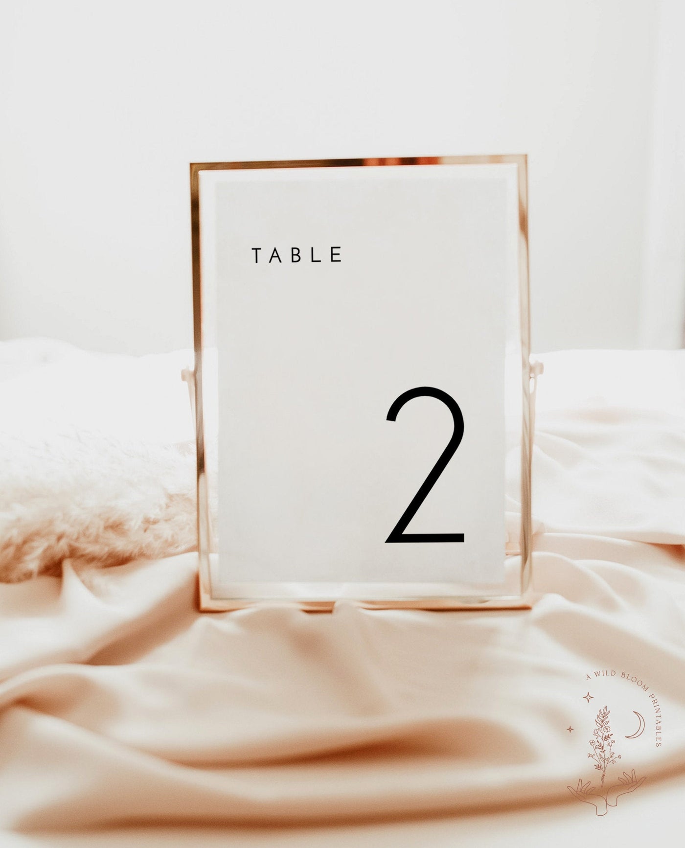
A table number that stands on the table — framed, acrylic, or a tented card — usually lives in the 5x7 inch range, with some couples going to 4x6 for smaller, lower-profile tables. The number itself should be at least 2–3 inches tall so it reads across a room. If your design buries a small numeral inside a lot of decoration, bump up the font size. People are reading these at a glance, often while holding a drink.
Tall / raised table numbers
If your centerpieces are low (think compote bowls of flowers, scattered votives), you can get away with a 5x7 standing sign. If your centerpieces are tall (raised arrangements, candelabras), guests can't see a short sign at all. In that case, mount the number on a tall stand or a stake that rises above the flowers, or accept that the number needs to be larger and higher. Walk your venue layout in your head: if you can't see the number past the flowers, neither can your guests.
The squint test
Here's a free trick: print one sample at full size, prop it on your kitchen table, and walk fifteen feet away. Can you read it instantly? If you hesitate, it's too small or too thin. Bold, high-contrast numerals win every time over delicate script when it comes to actual readability. You can be elegant and legible — they're not enemies.

Display Formats: Framed, Acrylic, Tented, and Attached
Same number, very different vibe depending on how you display it. Here's an honest rundown of the main formats and who each one is for.
Framed cards
A printed card slipped into a standing frame. Endlessly flexible, easy to source frames cheaply, and you can match metallics (gold, black, acrylic frames) to your color story. The look depends entirely on the frame quality, so if you're going budget, lean into uniform simple frames rather than a mismatched thrift-store look (unless mismatched-vintage is your aesthetic — then go for it).
Best for: couples who want flexibility and are happy to assemble a few things. Pairs well with a printed card you design yourself from an editable wedding template and slot into frames you buy locally.
Acrylic signs
Clear acrylic with printed or vinyl lettering. Modern, clean, and very on-trend. They photograph gorgeously with light passing through them. They're typically pricier and you usually order them pre-made, so your design has to be locked early. Frosted and tinted acrylic options exist if clear feels too stark.
Tented (folded) cards
A single card folded into a self-standing tent — often printed on both sides so the number faces both halves of the table. The most affordable, no-frame-needed option, and very travel-friendly because they pack flat. They sit lower, so they're best with low centerpieces. Great budget choice that still looks intentional.
Attached to the centerpiece
The number clips, ties, or stakes directly into the floral arrangement or vase. Saves table space and looks seamless. The downside: it ties your number's placement to your florist's setup, so coordinate with whoever's doing flowers, and make sure the number still sits at a readable height and angle.
For printed-and-shipped foam-board or poster-style signs (sturdier, larger, no assembly), the studio's printed wedding signs collection is the place to look — and if you want the full breakdown of materials and durability, this guide to custom foam board signs covers sizes and materials in detail.
How Table Numbers Connect to Your Seating Chart and Escort Cards
This is the section that saves your reception from chaos, so don't skim it. Your table numbers are one-third of a system, and the system only works if all three parts agree.
Seating chart vs. escort cards — quick distinction
- A seating chart is one big display (a sign, mirror, or board) listing every guest and their table. Guests read it on the way in. One sign, everyone sees it.
- Escort cards are individual cards (one per guest or couple) laid out on a table, each printed with a name and table assignment. Guests grab theirs and carry it to the table. Often double as a small favor or place card.
You can do one or the other, or both. What matters is that whatever system you pick, the labels match your table signs exactly. If escort cards say "Table 7," the table sign says "7," not "Seven" and not "The Orchard."
The one rule that prevents 90% of seating confusion
Use identical labels everywhere. Same numbering or naming, same spelling, same style. This sounds obvious until you're designing the seating chart in March and the table numbers in May and forget what you did. Write your master table list in one document — "Table 1 = The Vineyard," etc. — and reference it for every sign. If you go hybrid (number + name), decide whether the seating chart shows the number, the name, or both, and be consistent.
For the full walk-through of building a seating arrangement without losing your mind, our wedding seating chart guide and the broader wedding sign checklist both touch on how the entrance signage (welcome sign, seating chart, escort table) sets up the table-number relay. Get the entrance flow right and the table numbers do the rest.

Menu Signs: Do You Even Need Them, and Which Kind?
Truth time: not every wedding needs printed menus, and that's completely fine. If you're doing a buffet of clearly labeled stations, or a casual taco bar, a formal per-place menu might be overkill. Menus shine most at plated, seated dinners, where guests want to know what's coming and a printed menu adds a little ceremony to the table.
There are three main menu formats, and they're not interchangeable — each solves a different problem.
1. Per-place menus (one per guest)
A menu card at every place setting. Most formal, most polished, and it lets each guest read at their own pace. It also doubles beautifully as a place card if you print the guest's name at the top. The cost: you're printing one per guest, so for 120 guests that's 120 cards. Layered with a napkin or under a charger, they look incredible.
Best for: plated dinners, formal weddings, anyone who wants the table to feel "set."
2. Shared table menus (one or two per table)
One larger menu card (often 5x7 or A5) propped in the center of each table, or two so both ends can read it. Far fewer to print — a 12-table wedding needs ~12–24 instead of 120 — and it still tells everyone what's for dinner. The trade-off is guests pass it around or lean in to read.
Best for: couples who want menus without the per-guest cost, family-style service, semi-formal receptions. Honestly the most practical middle ground.
3. One large shared menu (sign or poster)
A single big menu — a framed poster, an acrylic sign, or a foam-board sign near the dining area or buffet. Guests read it once. The most economical option (you print one) and great for buffets and stations. You can browse large-format options in the printed signs and posters collection, which is the same place your welcome sign and bar sign often come from.
Many couples mix formats: a large buffet menu sign plus small per-table menus, or per-place menus at the head table and shared menus elsewhere. There's no rule. Pick based on your service style and budget.
Menu Wording and Layout: Keep It Readable and Honest
A menu sign has one job: tell people what they're eating without making them work for it. Pretty is good; clear is non-negotiable. Here's how to lay one out.
Structure, top to bottom
- A header — your names and date, or simply "Dinner," or "Menu." Optional but ties it to the rest of your signage.
- Courses in order — typically First Course / Starter, Main / Entrée, Dessert. Use the actual course names if your caterer provided them.
- Dish names + a short description — one line is plenty. "Pan-seared salmon, lemon butter, roasted asparagus." You don't need a restaurant's worth of adjectives.
- Choices, if any — if guests chose chicken vs. fish vs. veg ahead of time, list all options, or print variant menus per dietary need.
Wording tips that actually matter
- Name allergens and dietary options clearly. "(V)" for vegetarian, "(GF)" for gluten-free, with a tiny key. This is a kindness, not a formality — guests with restrictions genuinely scan for it.
- Match your caterer's exact dish names. Get the final menu language in writing from your caterer before you print. Dishes change; print last.
- Keep descriptions short. Two to six words per dish. Long descriptions crowd the card and shrink your font.
- Mind the font size. Same squint test as table numbers — body text should be readable in dim, candlelit lighting. Aim for clean serif or sans-serif over heavy script for the dish names.
If you're designing the menu yourself, an editable digital template is ideal here because caterer wording always changes at the last minute, and you'll want to tweak the text the week before. You can find coordinating menu and sign layouts across the wedding collection.

One sign that often shares the same font and color story as your menus: a bar or signature-cocktail sign. It's a small, playful piece — drink names and a one-line ingredient list ("Gin, elderflower, prosecco") — and because people walk right up to it, sizing is forgiving (an 8x10 to 11x14 framed sign reads fine at arm's length). You'll find those larger formats in the printed signs and posters collection.
Keeping It All Cohesive: The Signage Family
Here's the thing that quietly makes a reception look "designed" rather than thrown together: every sign looks like it came from the same family. Your welcome sign, seating chart, table numbers, menus, and bar sign should share a visual language. When they do, guests feel it even if they can't name why.
The three things to match
- Fonts. Pick one or two fonts and use them everywhere. A display font for headers and a clean font for body text. Don't introduce a new typeface on every sign.
- Colors. Same palette across all signage — ink color, accent color, any metallics. If your welcome sign is black-on-white with gold accents, your table numbers and menus should be too.
- Layout feel. Centered vs. left-aligned, the amount of white space, whether you use little floral motifs or keep it minimal — keep this consistent.
This is the single biggest argument for buying your signage as a matching set from one place rather than piecing it together from five different shops. When your welcome sign, seating chart, table numbers, and menus all come from the same design family, cohesion is automatic. The studio designs these as coordinated suites in the printed wedding collection for exactly this reason.
If you're a few signs deep and worried you've already mismatched things — you haven't ruined anything. Pick the font and color from your most important sign (usually the welcome sign or invitation) and bring everything else toward it as you finalize. Cohesion is a direction, not a test you pass or fail.

Printed-and-Shipped vs. Editable Templates: Which Makes Sense Here?
Both work. The right choice depends on your time, your quantity, and how much you enjoy a craft afternoon. Here's the honest breakdown for table numbers and menus specifically.
Editable digital templates (you print)
You edit the text yourself in your browser (Templett), then print at home or through a local print shop. Best when:
- You want the lowest cost, especially at high quantities (120 per-place menus get expensive to ship, cheap to print).
- Your menu wording is still changing — you can re-edit and re-print the week of.
- You're doing framed or tented cards and just need the printed inserts.
- You enjoy a little DIY and have time 2–3 weeks out.
Browse editable options in the wedding collection or the broader digital downloads. If you're weighing this decision overall, this honest comparison of editable templates vs. printed-and-shipped lays out the trade-offs.
Printed and shipped (we make them, you unbox them)
The studio personalizes and ships finished signs — sturdy foam-board or poster table numbers, menu signs, and bar signs. Best when:
- You want zero assembly and zero trips to the print shop.
- You want larger, sturdier signs (big shared menus, bar signs, statement table numbers) that hold up and travel well.
- You're short on time and would rather not babysit a printer the week of your wedding.
- You want guaranteed color and material consistency across the whole signage family.
Shop these in the printed wedding and printed signs and posters collections, or see everything in printed and shipped.
The mix that works for most people
A really common, budget-smart approach: printed-and-shipped for the big statement pieces (welcome sign, large bar/buffet menu, seating chart) and editable templates for the high-quantity small stuff (per-table menus, table number inserts you frame yourself). You get durability and impact where it counts and save money on the items you need a lot of. There's no purity test here — mixing is smart, not lazy.
Your Realistic Shopping and Printing Checklist
Okay — here's the part to actually act on. Work this top to bottom and you won't forget anything.
6–8 weeks out: decide and design
- Lock your labeling system: numbers, names, or hybrid. Write a master table list in one document.
- Confirm your menu format: per-place, shared per-table, or one large sign (or a mix).
- Choose your display format for table numbers: framed, acrylic, tented, or attached.
- Pick your fonts and colors — match them to your welcome sign or invitation so everything coordinates.
- Decide printed-and-shipped vs. editable for each sign type.
4–6 weeks out: finalize counts and wording
- Calculate your sign count: final table count + 2–3 specialty signs (gift, cake, guest book, bar) + 1–2 spares.
- Get your caterer's final menu wording in writing, including allergen and dietary info.
- Confirm signature cocktail names and ingredients for the bar sign.
- Cross-check labels: table signs match the seating chart match the escort cards. Same spelling, same style.
- Order any printed-and-shipped signs now so there's buffer for production and delivery.
2–3 weeks out: print and assemble
- Do the squint test on one full-size sample before printing the full batch.
- Print menus and table number inserts (if DIY); buy frames or stands.
- Assemble and box by table — group each table's number, menu, and place cards together so setup is fast.
- Print 1–2 spares of each for the inevitable bent or coffee-stained casualty.
Week of: hand off
- Pack everything in one labeled bin and give it to your coordinator or a designated setup person with a simple table map.
- Include a printed master list so whoever sets up knows which sign goes where.
- Breathe. Genuinely. This is the last signage task, and you've done it.
A Few Honest Reassurances Before You Go
Nobody at your wedding is going to grade your table numbers. They're going to find their seat, read what's for dinner, get a drink with a cute name, and have a great night. If a sign is a little crooked or you ran out and one table got a handwritten card, the day is still beautiful and the marriage still counts. Promise.
The couples who feel most relaxed about this decided their labeling system early, kept the fonts consistent, and ordered a couple of spares. That's the whole game. Wedding table numbers and menu signs are details, and details are supposed to serve the day, not stress you out before it.
When you're ready to make them, the studio's printed wedding collection has coordinated table numbers, menus, and signs we personalize and ship to you, and the printed signs and posters collection covers the larger bar and buffet menus. Prefer to print yourself and tweak the wording the week before? The editable templates in the wedding collection are built for exactly that. Either way, you've got a system now — go enjoy the part where you actually get married.
Want to map out every other sign you'll need first? Start with the complete wedding sign checklist, then come back here to finish the table-and-menu details.