Wedding Seating Chart Ideas and Displays (That Actually Work)
Let's be real: your guests will not remember whether your seating chart was a mirror, an acrylic panel, or a printed poster. They will, however, remember standing around for ten minutes with a drink in hand, scanning a wall of names, trying to figure out where on earth they're supposed to sit. The seating chart is one of those wedding details nobody compliments and everybody uses — which is exactly why it's worth getting right.
The good news: you don't need a Pinterest-famous installation to pull this off. You need a chart that's easy to read, organized so it makes sense, and displayed so a hundred people can find their names without a traffic jam. If you're staring at a spreadsheet feeling like everyone you've ever met has an opinion about who sits next to whom — you're not behind, and you're not doing it wrong. This is genuinely the hardest logistics puzzle of the whole wedding, and almost everyone finds it stressful.
This guide walks through the real wedding seating chart ideas and decisions that actually matter: whether you even need assigned seating, tables versus seats, how to build the chart without losing your mind over family politics, every display format that works (and the one that doesn't), how to organize and word it, and how to match it to your other wedding signs and decor. We'll cover both ways to get one too — an editable digital template you print yourself, or a printed-and-shipped sign that arrives ready to display. Let's get into it.

Do You Even Need Assigned Seating? (The Honest Answer)
Before you spend a single hour building a chart, ask the real question: does your wedding actually need assigned seating at all? Plenty of weddings run beautifully with open seating, and you're allowed to skip the whole thing if it fits your day.
Here's the rough rule most planners use. Open seating works fine when you have under 50 guests, a casual vibe (backyard, brewery, cocktail-style reception), or no plated meal. Above about 50 — and definitely above 100 — it starts to fall apart. You get awkward gaps, couples split up, that one table nobody wants, and elderly relatives left standing while younger guests grab the good spots.
You almost certainly want assigned seating if any of these is true:
- You're serving a plated dinner — caterers usually require it so they know who gets the chicken vs. the salmon.
- You have 100+ guests and want to avoid the standing-around shuffle.
- You have family dynamics that need managing (divorced parents, exes, the uncle who argues politics).
- You have guests with mobility needs who should be near the entrance or restrooms.
- You simply want the reception to flow without a bottleneck at the door.
If you land on open seating, you can skip the chart-building parts and go straight to signage — a simple "Sit wherever feels like home, there's no wrong seat" sign does the whole job, and you'll want it to match your welcome signs and posters anyway. It still pairs with everything else in your wedding signage set. For everyone else, keep going.
Assigned Tables vs. Assigned Seats: Pick the Right Level
This decision quietly determines how much work the rest of the process will be, so make it early. There are two levels of "assigned," and they are not the same amount of effort.
Assigned tables (the sweet spot for most weddings)
You tell each guest which table to go to, and they pick any open chair there. This is what most weddings do, and for good reason. It gives you control over the groupings — friends with friends, family with family, keeping the peace where you need to — without forcing you to agonize over individual seats. Guests sit next to whoever they want at the table, and you're off the hook for micro-decisions.
If you're not sure which level you need, this is almost always the answer. Assigned tables solve the vast majority of the problems open seating creates, with a fraction of the work of assigned seats.
Assigned seats (more control, more work)
You assign every guest a specific chair, usually with a place card at each setting. Reasons to do this: a very formal plated dinner, strict caterer requirements for individual meal choices, or a guest list with enough landmines that you want total control over who sits beside whom. The trade-off is real — assigned seats mean place cards for every guest, and any last-minute change ripples through the whole table.
A common hybrid: assigned tables on the main chart, plus place cards only at the head table or family tables where seat order matters. Precision where it counts, flexibility everywhere else.

Start With the Guest List (6–8 Weeks Out)
You cannot build a seating chart until your RSVPs are basically in, which is why this lands about 6–8 weeks before the wedding for most couples. Set your RSVP deadline for roughly 3–4 weeks out, then give yourself a buffer to chase the stragglers — and there will be stragglers. You'll be texting "hey, just confirming!" to a handful of people no matter how clear your invitation was.
Here's the order of operations that keeps this manageable:
- Lock your final headcount first. Don't start arranging tables while numbers are still moving — you'll just redo it.
- Confirm your table count and capacity with the venue. How many tables fit, what shape, how many chairs each. This is non-negotiable input.
- Group before you place. Sort guests into natural clusters (college friends, your mom's side, coworkers, the kids) before you assign anyone to a specific table.
- Place the anchor tables. Head table, immediate family, and any must-handle-with-care groups go down first.
- Fill in around them. Everyone else slots into the remaining tables by group.
- Build the display last. Only once seating is final do you design the actual chart or order cards.
That last point matters: don't order a printed chart or place cards until the seating is genuinely locked. A change after printing is annoying; a change after you've handwritten 120 place cards is a small tragedy.
The Tools That Actually Make This Easier
You do not have to do this with sticky notes on the dining room table (although honestly, that method still works and a lot of people swear by it). A few approaches, from lowest-tech to highest:
- The sticky-note / index-card method. One name per note, one sheet per table. Physically move people around — tactile, forgiving, and you can do it on the couch. Great for under 80 guests.
- A spreadsheet. Columns for name, group, table, meal choice, dietary needs, plus-one. Sortable, searchable, and it becomes the master document you hand to the caterer and venue. This is the workhorse — even if you arrange with sticky notes, transfer the final plan into a spreadsheet.
- Free online seating-chart tools. Most wedding-planning sites have a drag-and-drop table builder that syncs with your RSVP tracking.
Whatever you use, keep one master list as the source of truth. The number-one cause of seating-chart chaos is three slightly different versions floating around — yours, your mom's, and the one you texted your maid of honor. Pick the master and make every change there.
The Dreaded Family-Politics Part (You're Not Imagining It)
Here's the truth nobody tells you: arranging the actual people is 10% logistics and 90% diplomacy. If you've been dreading this part, that's normal — and feeling stressed about it does not mean you have a dramatic family. It means you have a family.
A few hard-won principles that make it survivable:
Seat people near someone they know
The kindest thing you can do for a guest is not seat them at a table of strangers. Cluster by existing relationships. The "let's help them make new friends" instinct is sweet and almost always backfires — save matchmaking for the dance floor.
Handle divorced parents and exes deliberately
If you have divorced parents, talk to them before you finalize anything. Usually the answer is giving each their own table with their own people, rather than forcing a shared one. You don't have to make everyone happy — you have to make the room workable.
Build a "wildcard" table on purpose
You'll have leftover guests who don't slot neatly anywhere — a few work friends, a cousin's plus-one, the family friend who knows nobody. Instead of scattering them awkwardly, build one warm, social table of fun people who'll get along. Frame it as the "fun singles and free spirits" table, not the island of misfit guests.
Give yourself permission to disappoint someone
You will not get this perfect. Someone will wish they'd sat somewhere else, and that's okay. Your job is a room that mostly works, not one that pleases every single person — that room doesn't exist. Do your honest best, then let it go.

Alphabetical vs. By-Table: How to Organize the Chart Itself
Once the seating is set, you have to decide how guests will read it. This is where a lot of otherwise-gorgeous charts fail, because a beautiful chart that's organized wrong creates exactly the bottleneck you were trying to avoid.
Alphabetical by guest name (almost always the winner)
List every guest alphabetically by last name, with their table number beside it. A guest walks up, finds their name under the right letter, sees "Table 7," done. This is the most user-friendly format for a single display, because guests know their own name — they don't know their table yet. That's the whole point: they come to the chart to learn the table. For a 100-guest wedding, alphabetical-by-name moves people through fastest. Use it unless you have a specific reason not to.
By table number (looks great, reads slower)
You group names under each table heading: "Table 1" with its eight names, "Table 2" with its eight, and so on. It looks editorial, and it works if guests already know their table — which is why it pairs perfectly with escort cards. As the only display, though, it forces guests to scan every table for their name, which is slow and creates crowding.
A practical compromise: alphabetical on the big chart so people find their table fast, then table-number headers on the individual table signs. Best of both.
The Display Formats That Actually Work
Now the fun part — how the chart physically shows up in your space. There are three main families of format, and the right one depends on your guest count, budget, and how much DIY you're up for.
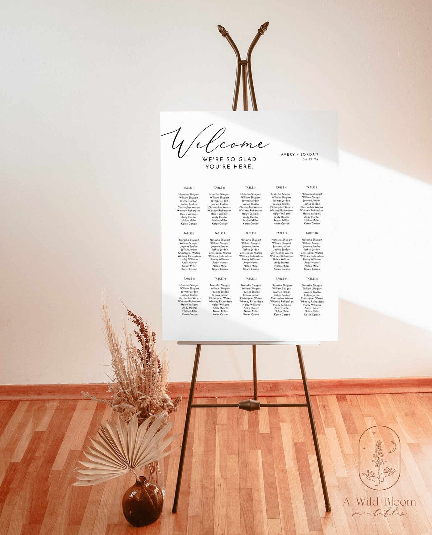
1. A single sign, poster, or panel (the modern default)
One large display with everyone's name on it. This is the most popular format right now because it's clean, it's one thing to make instead of a hundred, and it photographs beautifully. Within this category:
- Printed sign or poster. A large-format printed chart, foam-board mounted or framed. The most budget-friendly and the easiest to read because text and color are fully under your control. This is where a printed sign or poster shines, and it's what most couples actually choose. If you want to understand the materials, the foam-board option is worth a look — our guide to custom foam board signs, sizes, and materials covers exactly what you're getting.
- Acrylic panel. Clear acrylic with names printed or vinyl-lettered. Modern and slightly upscale, and it photographs beautifully against greenery or a draped backdrop.
- Mirror. Names hand-lettered or vinyl-applied onto a mirror. Gorgeous and very on-trend, but read it in person first — glare and reflections can make a mirror genuinely hard to read in a bright room or with a flash. Beautiful, but test it.
For most weddings, a single printed chart is the sweet spot: affordable, legible, and easy to coordinate with the rest of your wedding signage — or grab the editable version from the wedding collection and print it yourself.
2. Escort cards (the flexible classic)
Individual cards — one per guest or couple — each with a name and table number, laid out near the entrance. Guests grab their card and carry it to their table.
The big advantage: escort cards are forgiving. A last-minute change means reprinting one card, not redoing an entire sign. They also double as a display moment — arranged on a table, tied to favors, clipped to a ribbon wall, tucked into a citrus or a wine cork. The trade-off is more pieces to make, organize, and keep alphabetized so guests find their card without digging.
Quick terminology note that trips people up: escort cards tell a guest which table (they "escort" you to your seat) and live at the entrance. Place cards sit at the actual place setting and assign a specific chair. You can use both, or just one. Either way, design them to match the rest of your wedding pieces so the entry table looks intentional, not improvised.
3. A combination (chart + cards)
Plenty of couples use a main chart to send people to their tables, then place cards at each setting for assigned seats. This is the most formal, most controlled setup — and the most work. Reserve it for plated dinners or guest lists that genuinely need seat-level control.

How Many Guests Per Table? (Real Numbers)
This depends on your table shape and size, and your venue or rental company will give you exact numbers — but here's the planning math so you're not guessing:
- 60-inch round: seats 8 comfortably, 10 if cozy. The most common reception table.
- 72-inch round: seats 10 comfortably, up to 12 tight.
- 6-foot rectangular: seats 6–8.
- 8-foot rectangular: seats 8–10.
- Long banquet (king's) tables: seat as many as the length allows — plan roughly 24–30 inches of width per person.
A few rules of thumb so tables feel right, not crammed: don't max every table to its limit — one or two open seats make the room feel less packed. Avoid tables of just 2–3 people, which feel lonely. And keep your head or sweetheart table visible, since that's where photos happen.
Wording and Headers: What to Actually Put on the Chart
The text on your chart does two jobs — it has to function (guests find their table) and it sets the tone. Keep the functional part dead simple; save the personality for the header.
The header / title line
A short line at the top that names what this is. Options that work:
- "Find Your Seat" / "Take a Seat" / "Please Find Your Seat"
- "Find Your Table"
- "We're So Glad You're Here — Find Your Table Below"
- Just your names + date, with "Seating Chart" small underneath
- A warmer line for open-ish weddings: "Pick a seat, not a side."
The body
For an alphabetical chart: guest name, then table number. That's it. Resist the urge to cram in the venue, the date, a quote, and a monogram — clutter is the enemy of a chart people read from three feet away in dim reception lighting.
Naming your tables (optional, fun)
Instead of numbers, some couples name tables — places they've traveled, favorite songs, flowers, books. It's charming, but adds friction: guests have to remember "Santorini" instead of "7," and your table signs and chart must spell it the same way. If you go this route, keep names short and add a small number to each table sign as a backstop. For those table signs and matching menus, our guide to every wedding sign you need walks through the full set.
Make It Readable (The Part Everyone Skips)
This is the difference between a chart that works and a pretty chart that creates a line out the door. None of it is hard — it's just easy to forget when you're focused on how it looks.
- Big enough text. Names should be legible from about 3 feet away. If you're squinting at the proof on your laptop, it'll be worse in person.
- High contrast. Dark text on a light ground (or the reverse) reads far better than tone-on-tone. Save the moody blush-on-cream palette for your invitations — the chart needs to work.
- Generous spacing. Crowded columns are exhausting to scan. Give names room to breathe even if it means a slightly bigger sign.
- Logical columns. If alphabetical, make the A–Z flow obvious — top to bottom, then next column. Don't make people hunt.
- Mind the lighting. A mirror or glossy acrylic can glare under reception lights or a flash. Matte printed signs are the safest bet.
One more: place the chart where there's room to gather — near the reception entrance, but not so tight to the door that a crowd blocks the flow. Give people space to step up, find their name, and move on.

Sizing Your Chart to Your Guest Count
A common mistake is ordering a chart that's too small for the number of names you're cramming onto it. Rough guidance for a single printed sign or poster:
- Up to ~40 guests: an 18×24" sign is plenty.
- 40–100 guests: go 24×36" so names stay large and columns don't get cramped.
- 100–150+ guests: 30×40" or larger, or split into two coordinated panels.
If your list is large (150+), escort cards or two side-by-side panels often beat one enormous sign, because a single giant chart turns into a wall everyone crowds at once. The same sizing logic applies to your other big-format pieces — our breakdown of what size a wedding welcome sign should be covers dimensions and easel pairings that carry straight over to seating charts.
Last-Minute Changes (Because There Will Be Some)
Someone will cancel the day before. Someone's plus-one will materialize out of nowhere. A table of ten becomes a table of eight. This isn't a sign you planned badly — it happens at every wedding. The goal isn't to prevent changes; it's to set yourself up so they're no big deal.
How to stay flexible:
- Leave a buffer seat or two per table. Don't max out every table — that one empty chair absorbs a surprise plus-one without a redesign.
- Keep a "flex" table in mind. Know which table can shrink or grow without breaking the room.
- Order escort cards for volatile sections. If part of your list is prone to changes, cards for those guests let you swap one piece instead of reprinting a whole sign.
- Build in a print buffer. If you're printing a chart, finalize the file 2 weeks out for printed-and-shipped, or keep an editable template you can update and reprint locally the week of.
- Assign a point person. Hand your final master list to your planner, coordinator, or a calm friend so day-of changes go to them, not to you in your dress.
This is where the format choice earns its keep — an editable file or a stack of escort cards gives you a release valve a single pre-printed sign doesn't (more on that trade-off in the next section). Decide early how you'll handle the inevitable, and the changes stop feeling like emergencies.
Editable Template vs. Printed & Shipped: Which Chart Is Right for You?
However you design it, you'll get your chart one of two ways, and the right call depends on your timeline and how confident you are in the list.
Editable digital template (print it yourself). You buy a designed template, type in your names and table numbers, and print it at a local shop or at home for smaller sizes. The upside is full control and instant changes — a guest cancels Thursday, you update the file and reprint. It's the most flexible and usually the most affordable route, ideal if your list is still wobbling close to the date. Browse the editable options in the wedding collection.
Printed & shipped (we personalize and ship it). You send us your finalized names and table assignments, and we print and ship a ready-to-display chart — foam-board mounted or poster-ready, no print run, no DIY. It arrives done, in the size and finish you chose, looking exactly like the proof. The trade-off is the timeline: lock your list enough to send the file with a little lead time. Explore ready-to-go options in printed wedding signs and printed signs and posters.
Not sure which suits you? Our honest comparison of editable templates vs. printed and shipped applies to seating charts as much as invitations — same trade-offs, same decision.

Pair the Chart With Your Other Signage (So the Room Feels Whole)
Here's where a seating chart goes from "a sign with names" to "part of a wedding that feels designed." When your seating chart, welcome sign, table numbers, and menus all share a font, a color, and a feel, the whole room reads as intentional — even if you spent very little.
The pieces that should coordinate with your chart:
- Welcome sign at the entrance — the first thing guests see, and it should rhyme with the chart they hit moments later. For wording, our welcome sign wording ideas and welcome sign ideas for every style give you a running start.
- Table numbers or names — these literally have to match what's on your chart, so design them together.
- Menus at each setting, in the same font and color as the chart — you'll find them alongside the table numbers in printed wedding.
- Bar, guestbook, favors, and directional signs — the little signs that tie the day together.
The easiest way to get this cohesion is to buy your signs as a coordinated set or from the same design family, so the fonts and colors already agree. Our complete wedding sign checklist lays out every sign you might want — welcome sign, seating chart, table numbers, the "in loving memory" table — so you can plan the whole suite at once instead of scrambling three days before the wedding. The full lineup lives in the printed wedding and broader wedding collections, with large-format welcome and directional pieces in printed signs and posters.
A Quick Realistic Timeline
To pull it together, here's roughly when each piece happens:
- 8 weeks out: RSVP deadline set; chase outstanding replies.
- 6 weeks out: Final headcount locked; confirm table count and capacity with the venue.
- 5–4 weeks out: Group guests, place anchor tables, arrange everyone else. Handle the family-politics part now, not later.
- 3 weeks out: Seating finalized. Choose your format (sign vs. cards), finalize wording and table names/numbers.
- 2 weeks out: Send the file for printed-and-shipped, or finalize your editable template. Coordinate it with your other signs.
- Week of: Make any last swaps (this is what the buffer seats and editable file are for). Hand the master list to your point person.
- Day-of: Place the chart near the entrance with room to gather. Breathe.
If you remember one thing from this guide, make it this: a seating chart's entire job is to help a hundred people find a chair without stress. Readable beats fancy. Organized beats elaborate. A clean, high-contrast, alphabetical chart that matches your other signs serves your guests better than the most jaw-dropping mirror nobody can read under the reception lights.
Ready to Make Yours?
You've got the decisions sorted — assigned tables for most of you, a clear alphabetical chart, a format that fits your guest count, and buffer seats for the changes that are coming. Now it's just making the thing, and you don't have to start from a blank page.
If you want full control and the flexibility to update names up to the last minute, grab an editable template from the wedding collection and print it on your terms. If you'd rather it arrive done — personalized, printed, and ready for an easel — our printed wedding signs and printed signs and posters coordinate with your welcome sign, table numbers, and menus so the whole room feels like it goes together. Whatever you choose, your guests will find their seats, the room will flow, and you can get back to the part that matters — marrying your person. You've got this.