2026 Wedding Color Palettes: Terracotta, Sage, Dusty Blue and More
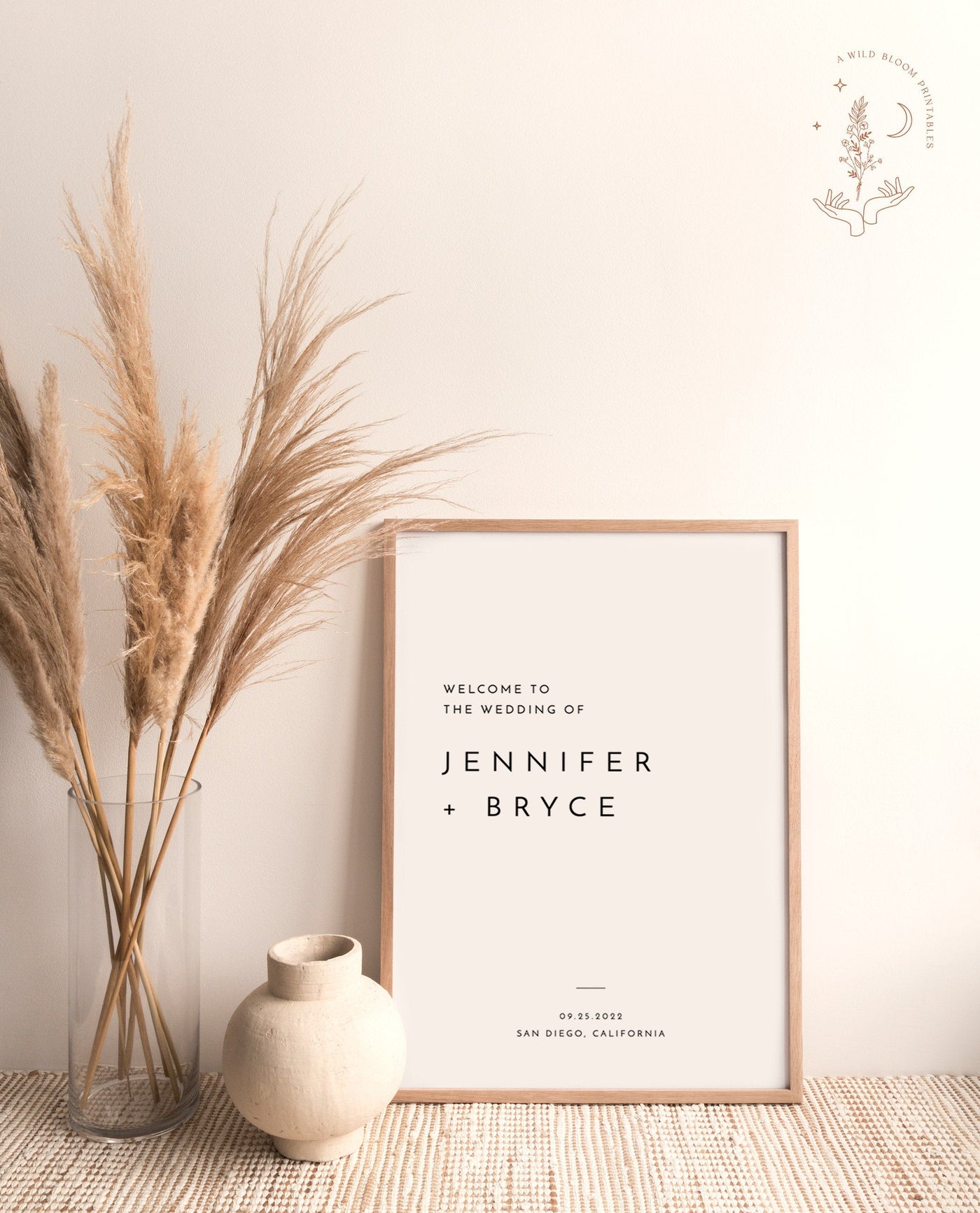
Let's be real: nobody at your wedding is going to remember whether you picked "sage" or "eucalyptus." But you will spend more hours agonizing over your color palette than almost any other decision — because it's the thread that ties everything together. The flowers, the bridesmaid dresses, the napkins, the welcome sign at the door. Get the palette right early, and a hundred smaller decisions get easier. Get it wrong, and you'll feel like you're fighting your own wedding the whole way through.
So this is the honest, no-fluff guide to 2026 wedding colors. We'll start with how to actually choose a palette that works for your season, venue, and the flowers you can actually get — not a Pinterest board that falls apart in real life. Then we'll walk through 12+ specific palettes for 2026, naming the exact colors, the mood, the best season, the flowers that fit, and — the part most guides skip — how to carry your colors through your invitations, save-the-dates, and signage so the whole thing feels like one wedding instead of three.
If you're staring at a blank Pinterest board feeling behind, you're not behind. Most couples don't lock a palette until well into planning, and plenty nail it later. Let's make it easy.
First, How to Actually Choose a Wedding Color Palette (Not Just Pick Pretty Colors)
Picking colors in a vacuum is how people end up with a palette that looks gorgeous on screen and wrong in person. There are four real-world filters that should drive your choice. Run your favorites through all four first.
1. Start With Your Season (It Does Half the Work)
Your wedding date already narrows the field more than you think. Light, airy palettes — dusty blue, blush, soft sage — feel natural in spring and summer when the light is bright and you've got greenery everywhere. Deeper, warmer palettes — terracotta, burgundy, rust, mustard — sing in fall and winter when the world outside is already amber and moody.
You can do an off-season palette, but you'll be working against the grain, which usually means spending more on flowers and decor to sell the look. Going with your season is the budget-friendly cheat code.
2. Let Your Venue Cast the First Vote
Walk your venue (or stare hard at the photos) before you fall in love with a palette. A venue brings its own colors you can't paint over: the wood tones, the stone, the carpet, the wall color, the view out the window.
- Warm wood barns and rustic spaces: terracotta, sage, cream, mustard, and rust all glow here. Cool grays and icy blues can feel like they're clashing with the wood.
- Modern lofts, galleries, and white-box venues: black and white, jewel tones, and high-contrast palettes look intentional. Soft pastels can read washed-out against stark white walls.
- Garden, vineyard, and outdoor venues: you already have green for free — lean into palettes that treat greenery as a base (sage, wildflower, dusty blue).
- Ballrooms and hotels with bold carpet: look down. That patterned carpet has a dominant color, and your palette needs to not fight it.
3. Consider Skin Tones — Especially for the People in Every Photo
This isn't about being precious. It's about the fact that your wedding party will be standing next to these colors in every single photo, and certain shades flatter more people across more skin tones. Muddy yellow-greens and very cool icy pastels are the trickiest — they wash some people out. Terracotta, dusty blue, sage, champagne, and burgundy are famously forgiving across a wide range of skin tones, which is part of why they keep trending.
If you're letting bridesmaids pick their own dress within a color family (a very 2026 move), give them a range of 2–3 shades so everyone can find something they feel good in.

4. Check What Flowers Are Actually Available
Here's the trap: you build a palette around a flower that's out of season on your date, and now your florist is sourcing imports at triple the cost. Before you lock colors, ask your florist what blooms are abundant and affordable in your month, then build around those. Peonies in May, dahlias in fall, ranunculus in early spring, garden roses nearly year-round — your palette and your flowers should be the same conversation, not two separate ones.
One More Rule: Pick a Base, an Accent, and a Pop
Almost every palette that works follows a simple structure. One dominant neutral base (cream, ivory, white, champagne), one secondary color that does most of the visible work (sage, dusty blue, terracotta), and one accent or "pop" used sparingly (a deeper tone or a metallic). Three to four colors total. More than that and things start to look like a craft store exploded. Keep it tight.
How to Carry Your Palette Through Paper and Signage (The Part People Forget)
Your colors don't live in the flowers. They live everywhere your guests look — and the single most reliable place to set the tone is your paper goods and signs. Your save the dates are the first impression of your palette, often arriving 8–12 months out. Your invitations reinforce it. And your welcome signs and posters are what guests literally walk up to at the door.
This is exactly why nailing the palette early pays off. If you know your colors at save-the-date time, every piece of paper after that can echo them, and the whole wedding reads as one cohesive thing instead of unrelated pretty moments.
With Wild Bloom, you can carry your palette through either way: as an editable digital template you customize in Templett and print yourself, or printed and shipped, where we personalize and ship the foam-board or poster signs to your door. For the big day-of pieces — the welcome sign especially — printed and shipped saves you a real headache. (More on the format trade-offs in our honest breakdown of editable templates vs. printed & shipped.)
Now — the palettes. For each one, I'll give you the colors by name, the mood, the best season, flowers that fit, and exactly how to translate it onto your stationery and signs.
1. Terracotta + Cream (The 2026 It-Palette)
The colors: Terracotta, warm cream, soft caramel, with a touch of rust or burnt orange. Add muted sage as a fourth if you want green in the mix.
The mood: Earthy, warm, sun-baked, a little Mediterranean. It feels relaxed but intentional — the kind of wedding where people kick their shoes off by the end.
Best season: Late summer and fall, hands down — the amber tones echo the light. It works for a desert or vineyard spring wedding too. Flowers: dahlias, garden roses in peach and rust, ranunculus, pampas accents, dried elements, and amaranthus for draping texture.
On paper and signs: Terracotta is forgiving in print because it photographs warm and rich. Do cream cardstock with terracotta hand-lettering for your invitations, and go bold with a terracotta-background wedding welcome sign in cream type at the entrance. It's one of the most-requested palettes in our printed & shipped lineup for a reason. Need help with the words? Our welcome sign wording guide has options for every style.

2. Sage Green + Ivory (The Can't-Go-Wrong Classic)
The colors: Sage green, ivory, soft white, with optional gold or champagne metallic accents.
The mood: Calm, fresh, organic, timeless. This is the palette you pick when you want it to look as good in your photos twenty years from now as it does today.
Best season: Genuinely all four, which is part of its magic. Brightest in spring and summer; pair with deeper greens and gold for fall. Flowers: eucalyptus, white roses, ranunculus, lisianthus, olive branches, and plenty of greenery as the actual base rather than an afterthought.
On paper and signs: Sage is the easiest palette to keep cohesive because greenery is everywhere already. Ivory save the dates with a sprig of sage, ivory invitation suites with green botanical line art, and a clean ivory welcome poster with sage lettering. Because it's so universal, it's a great choice if your venue has a lot going on — sage calms everything down. See more direction in our welcome sign ideas for every style.
3. Dusty Blue + Champagne (Romantic Without Being Fussy)
The colors: Dusty blue, champagne, soft ivory, with optional navy as a deeper anchor.
The mood: Soft, romantic, a little vintage, very photogenic. It feels elegant without trying too hard, which is exactly why it's been a top pick for years and isn't slowing down.
Best season: Spring and summer for the airy version; add navy and silver for a winter take.
Flowers: White and blush roses, delphinium, thistle for a hit of true blue, anemones, and dusty miller for that silvery foliage.
On paper and signs: Dusty blue prints beautifully and reads sophisticated in type. Do champagne or ivory cardstock with dusty-blue script for your printed invitations, and carry the blue onto your ceremony and reception signs. A champagne-background welcome sign with dusty-blue lettering is one of the most flattering combos for outdoor light. Make sure your suite covers everything with our complete wedding sign checklist.
4. Black + White Modern (Clean, Bold, Editorial)
The colors: True black, crisp white. That's it. Maybe a single metallic — gold or chrome — if you want one wink of shine.
The mood: Modern, graphic, confident, a little fashion-forward. This is the 2026 palette for couples who find pastels boring and want their wedding to look like it belongs in a design magazine (without us using the V-word).
Best season: Any. Black and white is fully season-proof, which makes it a great pick for winter and city weddings especially.
Flowers: Lean monochrome — all-white arrangements (roses, calla lilies, orchids) with dark green or even black-dyed accents. Texture does the heavy lifting here, not color.
On paper and signs: This is where black-and-white shines, because it's all about typography. Bold sans-serif or high-contrast serif type on stark white (or reverse it — white type on black). Your welcome poster can be almost entirely type and still look incredible. It's also the most legible palette from across a room, so your seating chart and bar signs actually get read. Browse the look in our printed wedding collection.

5. Wildflower / Garden (Joyful, Collected, Anti-Matchy)
The colors: A loose, happy mix — soft yellow, lavender, coral, blush, sky blue, plenty of green — all kept slightly muted so it reads "gathered from a meadow" instead of "circus."
The mood: Joyful, relaxed, romantic, a little undone. This is the palette for couples who hate the idea of everything matching perfectly and want their wedding to feel alive. (It's also, not for nothing, very on-brand for a studio named Wild Bloom.)
Best season: Peak spring and summer, when wildflowers are actually in bloom and cheap.
Flowers: Cosmos, bachelor's buttons, scabiosa, sweet peas, daisies, ranunculus, and whatever's growing locally. A "ditch the formal arrangement" energy.
On paper and signs: The trick with wildflower palettes is letting the paper be a little looser too — hand-painted florals, botanical illustrations, a mix of colors pulled from the bouquet. Tie it together by repeating one font family across your save the dates, invitations, and signs so the cohesion comes from the type even when the colors are playful.
6. Pampas / Boho Neutrals (Calm, Textural, Sun-Bleached)
The colors: Cream, beige, taupe, soft tan, warm white — a whole palette of "no color," held together by texture and warmth.
The mood: Serene, modern-boho, effortless, a little desert-wedding. It photographs like a slow exhale. Perfect for couples who want calm over color.
Best season: Late summer and fall are ideal (pampas grass peaks then), but the neutral base works year-round.
Flowers: Pampas grass, bunny tails, dried palms, bleached ruscus, white roses, and dried florals you can prep weeks ahead — a genuine budget and stress saver.
On paper and signs: Neutral palettes need texture and type to avoid looking flat. Use warm cream cardstock with tonal beige lettering and maybe a subtle arch motif. A tonal welcome sign — cream on tan — looks expensive and stays readable. Because everything's so soft, this palette leans hard on great signage to define the space; our welcome sign sizing guide helps you go big enough.
7. Moody Burgundy + Deep Green (Drama Done Right)
The colors: Burgundy, wine, deep forest green, with ivory or gold to keep it from going too heavy.
The mood: Rich, romantic, intimate, a little gothic-luxe. Candlelight and burgundy were made for each other. This is the palette for a moody fall or winter evening wedding.
Best season: Fall and winter, full stop. The deep tones can feel heavy in bright summer sun.
Flowers: Burgundy dahlias, deep red garden roses, ranunculus, plum calla lilies, dark foliage, and amaranthus for drama.
On paper and signs: Dark palettes are where reverse-printing earns its keep — burgundy or near-black backgrounds with ivory or gold type look genuinely luxe. Just watch legibility on day-of signs: keep the type large and high-contrast so your seating chart reads from a distance. A deep-toned welcome sign in gold lettering sets the mood the second guests arrive.
8. Citrus / Yellow (Bright, Happy, Underrated)
The colors: Lemon yellow, soft butter, with white, green, and maybe a hit of blue or orange for contrast.
The mood: Sunny, cheerful, fresh, optimistic. Yellow is the most underused wedding color and one of the most joyful. It's having a real moment for 2026 as couples move away from all-neutral everything.
Best season: Spring and summer — yellow wants sunshine behind it.
Flowers: Craspedia (billy balls), mimosa, ranunculus, daffodils in early spring, sunflowers for a bolder take, and lots of fresh green.
On paper and signs: Yellow is tricky in print — too light and it disappears, too neon and it's harsh. Pick a soft butter or lemon, pair it with crisp white and a real outline color (navy or green) so type stays legible. It's a fantastic palette for a citrus-themed welcome sign and bar menu. Lean into the theme on your save the dates with a lemon or citrus illustration.
9. Blush + Mauve (Soft, Modern Romance)
The colors: Blush pink, mauve, dusty rose, with cream and a warm metallic. Add taupe to ground it and keep it from going too sweet.
The mood: Romantic and feminine but grown-up — mauve gives it a dustier, more sophisticated edge than straight pink.
Best season: Spring and summer, though the mauve tones carry nicely into fall.
Flowers: Garden roses, peonies (in May–June), ranunculus, lisianthus, and astilbe for soft texture.
On paper and signs: Blush prints soft, so anchor it with a deeper mauve or taupe for your lettering — pure blush-on-blush disappears at a distance. This palette flows beautifully from engagement through the wedding; if you're early in the process, start it on your engagement announcements and carry it forward. It's also a natural for bridal shower stationery if you want the whole celebration to match.
10. Dusty Blue + Terracotta (The Best of Both Worlds)
The colors: Dusty blue and terracotta together, softened with cream and a touch of sage.
The mood: Unexpected but harmonious — the cool blue and warm terracotta balance each other into something fresh that still feels grounded. One of the smartest 2026 combinations because it bridges the two biggest trend colors.
Best season: Shoulder seasons especially — late spring and early fall — where you've got a mix of warm and cool light.
Flowers: Terracotta dahlias and roses with blue thistle, delphinium, and dusty miller. The contrast is the whole point.
On paper and signs: Use cream as your base, terracotta as the dominant accent, and dusty blue as the pop (or flip it). This is a palette where a coordinated suite really shows off — matching save the dates, printed invitations, and welcome posters make the unexpected combo look intentional rather than accidental.
11. Emerald + Gold (Jewel-Tone Glamour)
The colors: Emerald green, gold, with ivory or black to ground it.
The mood: Lush, luxe, regal, a little Art Deco. Emerald and gold is for couples who want richness and shine without going full burgundy-dark.
Best season: Fall, winter, and holiday weddings especially — emerald and gold feel celebratory against winter light. Flowers: white and ivory blooms (roses, orchids, calla lilies) against deep emerald foliage; the green comes from leaves more than petals, with gold from the details.
On paper and signs: Gold foil or gold ink against emerald or ivory is the move. This palette wants a little formality in the type — a refined serif, generous spacing. A welcome sign with gold lettering on emerald reads instantly elegant. Just keep day-of signs high-contrast so the gold-on-dark stays readable across the room.
12. Lavender + Sage (Soft, Fresh, A Little Unexpected)
The colors: Soft lavender, sage green, cream, with optional dusty purple to deepen it.
The mood: Gentle, dreamy, garden-fresh. Lavender is creeping back for 2026 in its muted, grayed-down form — paired with sage it feels modern instead of '90s.
Best season: Late spring and early summer, when lavender and herbs are actually growing.
Flowers: Lavender (real sprigs, which double as favors and scent), wisteria, lisianthus, stock, and lots of soft green.
On paper and signs: Lavender is light, so pair it with sage for your lettering to keep type legible. The herbal angle is lovely on paper — sprigs of lavender illustrated on your invitation suite and echoed on the welcome poster. It's also a beautiful crossover palette for a bridal shower invite if you want a soft, cohesive lead-up.
13. Navy + Blush + Gold (Timeless With a Twist)
The colors: Navy blue, blush pink, and gold, with ivory as the neutral base.
The mood: Classic and balanced — navy brings the gravitas, blush brings the romance, gold brings the warmth. This is the "please everyone, including your mother-in-law" palette, in the best way.
Best season: Year-round, though it leans a touch more formal, which suits fall and winter evening weddings. Flowers: blush and ivory roses, ranunculus, and a few true-blue accents (thistle, delphinium) with greenery — the navy lives in the linens and attire, not the flowers.
On paper and signs: Navy is one of the most legible dark colors in print, so it's a workhorse for signage — navy type on ivory reads from across any room. Use gold sparingly as the accent and blush as the soft touch. A navy-and-gold welcome sign never looks dated.
14. All-White + Greenery (The Ultimate Restraint)
The colors: White, ivory, and green. The most restrained palette there is, and one of the most elegant.
The mood: Clean, fresh, classic, effortless. When everything is white and green, the focus lands on the people, the light, and the textures. It's also one of the more budget-friendly palettes — white flowers and greenery are widely available and affordable.
Best season: All four — one of the most flexible palettes you can pick. Flowers: white roses, hydrangeas, ranunculus, lisianthus, baby's breath, and abundant eucalyptus or olive greenery as the structure.
On paper and signs: With no color to lean on, this palette lives or dies on typography and paper texture. Choose one beautiful font pairing and repeat it everywhere — save the dates through day-of signage. A simple white welcome poster with elegant black or green type is timeless and reads from anywhere.
A Few Honest Truths About Choosing Colors
Before you spiral, a little reassurance.
You don't have to invent a never-before-seen palette. The reason terracotta, sage, and dusty blue keep trending is that they genuinely work — across seasons, skin tones, and venues. Picking a "popular" palette doesn't make your wedding generic. What you do with it is what makes it yours.
Your palette can evolve. Locking sage + ivory at save-the-date time doesn't mean you can't add gold for the reception or deepen the green for a fall date. A palette is a direction, not a prison.
Screens lie about color. The best thing you can do is order physical samples — ribbon, paint chips, a printed proof — and look at them in natural light. The "dusty blue" on your monitor and the "dusty blue" of your napkins can be two different colors. It's also why a printed proof of your signage matters; what you approve on a screen isn't always what prints.
How to Translate Any Palette Onto Your Stationery (Step by Step)
Whatever palette you land on, here's the practical workflow for carrying it across your paper and signs so the whole wedding feels connected.
- Start at save-the-dates (8–12 months out). This is where you first show your colors to guests. Pick your base + accent here and commit to a font pairing. Browse styles in save the dates.
- Match your invitations to the save-the-dates (6–8 months out). Same palette, same fonts, more detail. Choose an editable digital invitation you print yourself, or go printed & shipped if you'd rather not deal with paper stock and a finicky printer.
- Plan your full sign list early. Don't wait until the month-of to realize you need eight signs. Use our complete wedding sign checklist to map them all out: welcome, seating chart, bar menu, guestbook, programs, and so on.
- Order day-of signage in your palette (2–3 months out). Welcome sign, seating chart, and the rest from printed signs & posters and printed wedding decor. For the big foam-board pieces, printed & shipped is the move — here's our breakdown of foam board sign sizes and materials.
- Carry the palette into the after-pieces. Your thank-you cards are the last impression — match them to everything else and the whole celebration bookends beautifully.
One more tip: if you're hosting a bridal shower or engagement party in the lead-up, you can pull a softer version of your wedding palette into those too. It makes the whole season feel like one story. And if you want games at the shower that match the vibe, our non-cheesy bridal shower games roundup pairs nicely with pretty printed party games.
Quick-Reference: Best 2026 Palette by Season
If you just want the cheat sheet, here's where each palette shines:
- Spring: dusty blue + champagne, lavender + sage, blush + mauve, citrus/yellow, wildflower/garden.
- Summer: sage + ivory, wildflower, citrus, dusty blue, all-white + greenery.
- Fall: terracotta + cream, moody burgundy + deep green, pampas neutrals, dusty blue + terracotta, emerald + gold.
- Winter: black + white modern, burgundy + green, emerald + gold, navy + blush + gold.
- Any season: sage + ivory, black + white, navy + blush + gold, all-white + greenery.
You've Got This — Pick Your Palette and Let the Paper Do the Work
Here's the simple version: a great wedding palette isn't about chasing the trendiest 2026 wedding colors on the internet. It's about choosing two or three shades that suit your season, flatter the people standing next to them, work with your venue, and match the flowers you can actually get — then repeating those colors and one good font family everywhere your guests look. That's the whole secret to a wedding that feels cohesive instead of cobbled together.
The easiest place to make that happen is your paper and signs. Whether you want editable digital templates to customize in Templett and print yourself, or printed & shipped pieces we personalize and send to your door, Wild Bloom has your palette covered from save-the-date to thank-you. Start with your save the dates, build out your invitation suite, and bring it home with day-of signage from our printed wedding collection and signs & posters. Take a breath — you're not behind, your colors are going to be beautiful, and the paper is the part we make easy.